Mapping the Election
November 8, 2004
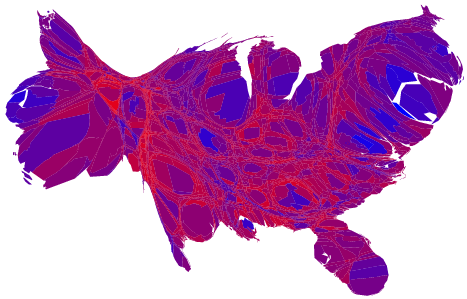
Since we still have one vote per person rather than one vote per acre in the US (for now), maps which attempt to explain the link between voting trends and democracy are somewhat deceptive, because some areas of the country are sparsely populated.
Three professors at the University of Michigan present some of the alternative wasy to map the election results. The most useful image is this snazzy cartograph, which shows the election results on a county-by-county basis, with each county scaled for population and shaded based on the strength of support for Bush or Kerry:
Trackbacks
Trackback URL for this entry: http://www.andrewraff.com/mt/mt-trackytrack.cgi/3121